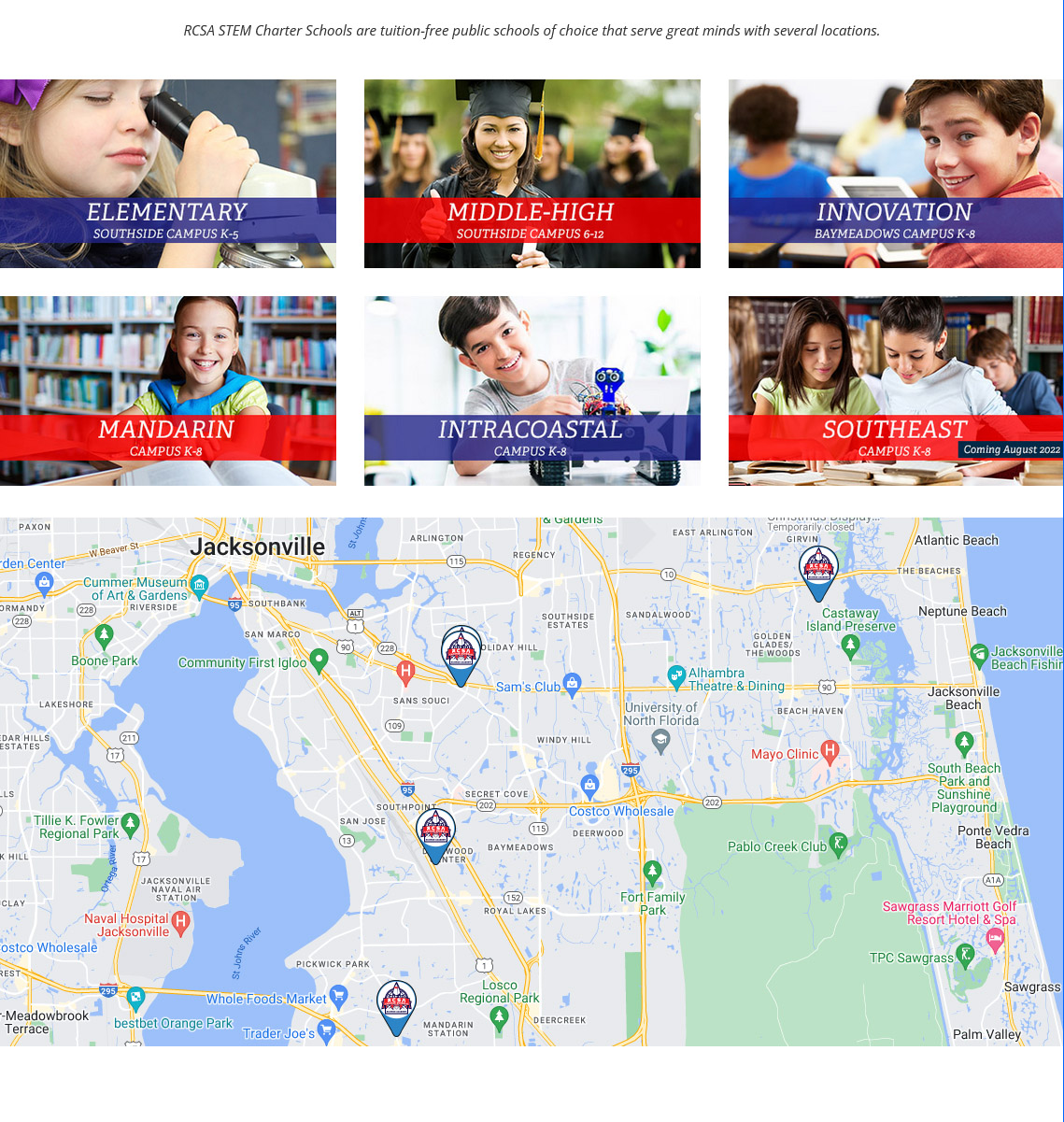
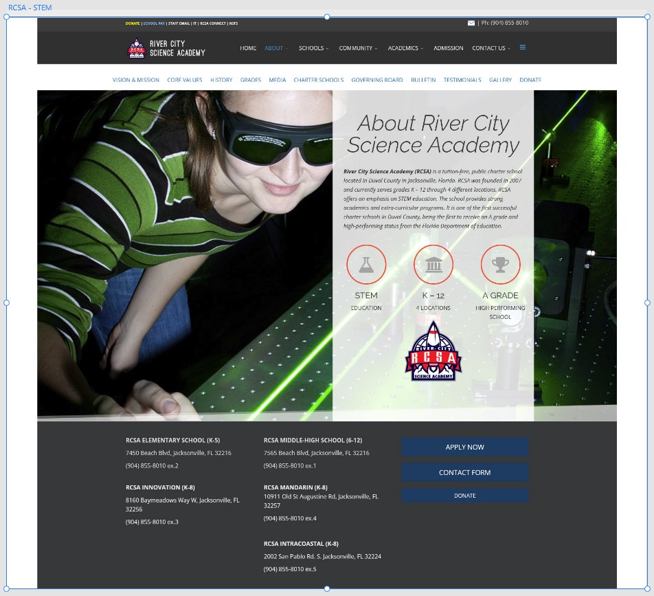
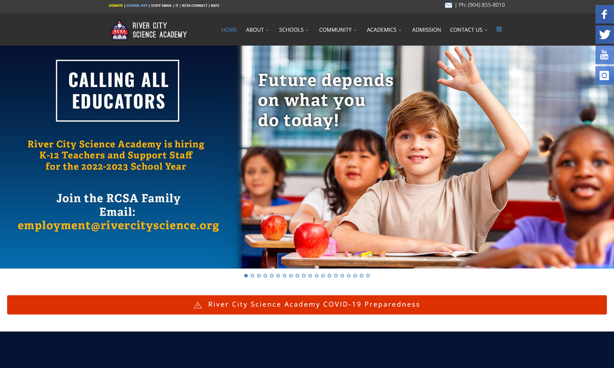
Problem: Poor User Experience. Poor performance, and bugs. Enrollment decreased by 10 percent in two years. Charter Schools are funded according to enrollment.
Goal: Improve the overall user experience, enhance end-users workflow. Create an effective apply online button, that gets the user’s attention and entices them to click. Increase STEM content on the website.
The Process:
I worked with UX Researchers to conduct interviews with 18 users (executive director, 5 administrators, 5 educators, 5 students) and 2 school board members. The research aimed to uncover issues and insights around the online experience of evaluating, online applications and finding resources on the RCSA website.
Discovery:
Collecting and analyzing information about the project, its intended market, and audience. Analyzing and reviewing current website. Competitive analysis and market search. 1-on-1 Sessions with Product owner, User Personas, User Interviews.
Planning – Ideate:
Brainstorm Sessions, Task flows for each user story, Rough Sketches, Wireframes
Design:
Interactive Prototypes, Evaluate, Finalize, Provide all deliverables and launch.
Test evaluation and Redesign
Finalize Designs
Visual UI Designs (Hi-Fidelity).
Final Sign-offs
Provide all deliverables to teams (attaching files to stories)
Development support. Monitor and gather feedback from end-users
The Outcome
- New Website design attracts more new parents and students. Enrollment increased by 35 percent.
- Prospective parents learn about the curriculum and other campuses around the city.
- According to visitors feedback the new website design is more user-friendly and organized.


